Knowledge is a sobering thing

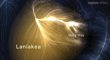
I sometimes wonder whether the thing that scares people about knowledge and science is how it can make you feel small and insignificant. This image is a visualization of the newest knowledge about where we on Earth fit in the universe. They’re calling it “Laniakea.”

It’s a very long way from when we thought that the Sun revolved around the Earth. For me, it engenders a sense of awe; what reaction does it trigger for you?


The video walks through the data analysis process that went into establishing our extended universal address. It’s a good example of Big Data and analytics at work. 

If you’re interested there are several good articles discussing this work:

Our Place in the Universe: Welcome to Laniakea

This is the most detailed map yet of our place in the universe

Rethinking data and decisions – Big Data’s Impact in the World – NYTimes.com

The New York Times recently ran an excellent overview of the evolving state of data analytics.

Big Data’s Impact in the World – NYTimes.com: “The story is similar in fields as varied as science and sports, advertising and public health – a drift toward data-driven discovery and decision-making. “It’s a revolution,” says Gary King, director of Harvard’s Institute for Quantitative Social Science. “We’re really just getting under way. But the march of quantification, made possible by enormous new sources of data, will sweep through academia, business and government. There is no area that is going to be untouched.”

Welcome to the Age of Big Data. The new megarich of Silicon Valley, first at Google and now Facebook, are masters at harnessing the data of the Web – online searches, posts and messages – with Internet advertising. At the World Economic Forum last month in Davos, Switzerland, Big Data was a marquee topic. A report by the forum, “Big Data, Big Impact,” declared data a new class of economic asset, like currency or gold.

This is the latest iteration in the ongoing interplay between judgment and evidence in decision making. Which means it’s worth considering how this argument has been evolving over time and how new discoveries, technologies, and techniques could change the issues or cause lasting change in how we go about making decisions.

Probability theory traces its roots to a conversation between Blaise Pascal and Pierre de Fermat over how to divide the pot in a card game if it weren’t possible to finish the game. Could you estimate the relative chances of each player winning the game based on the current state of the game and use those estimates to fairly distribute the pot? In other words, how can you use the evidence at hand to make a better decision?

When I was getting an undergraduate degree in probability and statistics (a long time ago), the core issues centered on what inferences you could draw about the real world from limited samples. What kinds of errors and mistakes did you need to protect yourself from? What precautions were appropriate to keep you from going beyond the data? The tools would always find some pattern in the data and we were repeatedly cautioned to take care not to see things that weren’t there.

A few years later, in graduate school, I revisited the topic in various required methods and analytical tools courses. The software tools were more powerful and were still capable of finding the slightest hint of a pattern in the noise. The faculty offered their obligatory cautions, but I watched plenty of students wreaking intellectual havoc with their new power tools, spinning conclusions from the thinnest threads of pattern in the data. For every hundred MBAs who learned to run a multivariable regression, one might read Darrel Huff’s How to Lie with Statistics.

Today, the tools continue to become more and more powerful at teasing out patterns from the data. At the same time, the exponential growth in available data means that we aren’t sampling so much as we are searching for patterns in the population as a whole. What is the lag between the power of our analytical tools and our capacity to apply sound judgment to the results?

Here are some of the questions I am beginning to explore:

  1. How does statistical inference change as we move from small, representative, samples to all, or most, of the population of interest?
  2. How do we distinguish between patterns in the data that are spurious and patterns that reveal important underlying drivers?
  3. When is an arbitrary or spurious correlation good enough to support a business course of action (Amazon doesn’t, and probably shouldn’t, care why “other people who bought title X, also bought title Y.” Calling my attention to title Y leads the incremental sales; who needs a causal model?)
  4. How does our deepening understanding of the limits and biases of human decision making connect to the opportunities presented in “Big Data”? Here, I’m thinking of the work Dan Ariely on behavioral economics and Daniel Kahneman on decision making.

I would value pointers and suggestions on where to look next for answers or insight.
The Joy of Stats available in its entirety

I’ve been a  fan of Hans Rosling since I saw his first TED video several years ago. Here’s a four-minute clip from a one hour documentary,The Joy of Stats , he did last year for the BBC.


Hans Rosling helps visualize economic development over the last 200 years

You can now find the entire video from the BBC by way of Rosling’s Gapminder website. I certainly wish both Rosling and this technology had been available when I was doing my undergraduate degree in statistics. I did have the benefit of excellent teachers, although none quite as gifted as Rosling. As for what the technology makes possible in terms of both extracting and explaining the stories hidden in the data, it is well and truly a brave new world.

Hans Rosling at TED India: making time visible

I’m turning into a bit of a Hans Rosling groupie, having blogged about several of his previous performances at TED conferences (Hans Rosling talk on world economic development myths and realities and More insights from Hans Rosling at TED 2007). Most recently, he presented at TED India. He’s a wonderful story teller and watching his material is its own class in better story telling. Watching his videos is one of those great twofers you get from the best teachers – insights into both his material and his technique. Here he takes a look at what the deep data trends have to tell us about Asia’s economic future.

Hans Rosling: Asia’s Rise – How and When – TED India


A version of the tool that Rosling uses for his data analysis and display is available at Gapminder World.

What is an Oreo?

Alan Matsumura and I had an excellent conversation earlier this month about the work he is starting up at SilverTrain. Part of the discussion centered on the unexpected problems that you run into when doing BI/information analytics work.

Suppose you work for Kraft. You’d like to know how many Oreos you sold last quarter. An innocent enough question and, seemingly, a simple one. That simply shows how little you’ve thought about the problems of data management.

Start with recipes. At the very least Kraft is likely to have a standard recipe and a kosher recipe (they do business in Israel). Are there other recipe variations; perhaps substituting high fructose corn syrup for sugar? Do we add up all the variations of recipe or do we keep track by recipe?

How about packaging variations? I’ve seen Oreos packaged in the classic three column package, in packages of six, and of two. I’ve seen them bundled as part of a Lunchables package. I’m sure other variations exist. Do we count the number of packages and multiply by the appropriate number of Oreos per package? Is there some system where we can count the number of Oreos we produced before they went into packages? If we can manage to count how many Oreos we made, how does that map to how many we will manage to sell?

That may get us through standard Oreos. How do we count the Oreos with orange-colored centers sold at Halloween in the US? Green-colored ones sold for St. Patrick’s Day? Double stuf Oreos? Double stuf Oreos with orange-colored centers? Mini-bite size snak paks? Or my personal favorite: chocolate fudge covered Oreos. I just checked the official Oreo website at Nabisco. They identify 46 different versions of the Oreo and don’t appear to count Oreos packaged within another product (the Lunchables question).

That covers most of the relevant business reasons that make counting Oreos tricky. There are likely additional, technical reasons that will make the problem harder, not easier. The various systems that track production, distribution, and sales have likely been implemented at different times and may have slight variations in how and when they count things. Those differences need to be identified and then reconciled. Someone will have to discover and reconcile the different codes and identifiers used to identify Oreos in each discrete system. And so on.

By the way, according to Wikipedia, over 490 billion Oreos have been sold since their debut in 1912. As for how many were sold last quarter, it depends.